An Example Case Study
The best way of showing how traffic-taffy can be used to analyze large datasets, we will walk through an example dataset to analyze its contents.
The Dataset
The dataset under study will be the [B_Root_Anomaly-20190907] dataset that contains traffic from a DDoS attack on the b.root-servers.net DNS root server, published by the [ANTLab] (of which the author is associated with). Note that this dataset contains a very large spike of traffic that is not particularly difficult for a human to necessarily perform this analysis by hand. Thus, it serves as a good example so that the data can be analyzed in multiple fashions in order to come up with hopefully similar conclusions. .
The README file’s description of this event is as follows:
Parameter |
Value |
|---|---|
Duration |
06:45:19 UTC to 06:46:53 UTC |
Sources |
Spoofed (Randomized) |
Query name |
No fixed query name |
Packet size |
554 bytes requests |
Using this informationn we select the following files from the dataset to study from the LAX anycast instance and that directly surround the event in question. Thus, we will use just these files when using all of them in the rest of this document.
20190907-064359-01587810.lax.pcap.xz
20190907-064519-01587811.lax.pcap.xz
20190907-064545-01587812.lax.pcap.xz
20190907-064550-01587813.lax.pcap.xz
20190907-064557-01587814.lax.pcap.xz
20190907-064603-01587815.lax.pcap.xz
20190907-064610-01587816.lax.pcap.xz
20190907-064653-01587817.lax.pcap.xz
Producing Cache Files
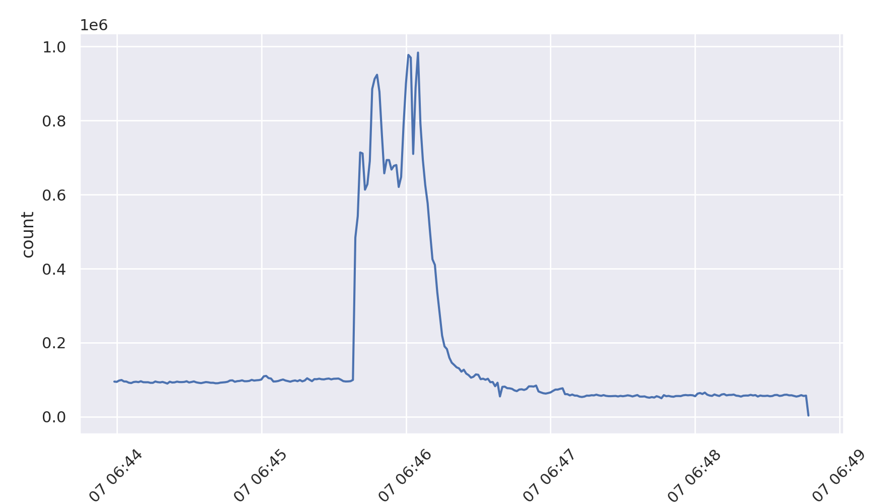
Using a level 10 dissection analyzer, with 1 second bin time we can produce a graph of the total traffic to get a feel for the size of the event. use -C to enable caching of the results (note: this first run will take a while to complete). We use the special identifier __TOTAL__ and sub-identifier packet to select just the total number of packets to create this graph.
Note: a first time level 10 analysis will take a long time to run, but future runs will be much faster because we turned on caching (-C)
taffy-graph -d 10 -C -b 1 -m __TOTAL__ -M packet -o total-traffic.png *.pcap.xz
Which produces the following graph:
Bug note: the -M packet shouldn’t be required
Starting with a high-level analysis
We will start by comparing all of the pcap files against each other to determine what is different between them. We use the taffy-compare utility todo this, selecting some parameters to limit the display to just those that are likely big jumps.
Note: now that a 1 second binned, level 10 cache file exists we can just use that (-C) and do not have to specify these parameters again.
taffy-compare -C -c 10000 -R 5 -t 10 *.pcap.xz
The full output can be found in this file , but we highly some of the output using screenshots of taffy-compare’s colorized terminal output.
The output is functionally a 7 column table that depicts the following items per packet field listed, which each field in question being listed as a header above the table section:
The value of the particular field
The count of this value in the “left” PCAP file
The count of this value in the “right” PCAP file
The delta between the left and right counts
The percentage of this value in all the values for this packet field in the “left” PCAP file
The percentage of this value in all the values for this packet field in the “right” PCAP file
The delta between the left and right percentages
Narrowing it down to just results before and during the attack
We look specifically at the output for the file that exists just before the start of the attack (20190907-064359-01587810.lax.pcap.xz) vs the one just within the attack (20190907-064519-01587811.lax.pcap.xz).
- ::
- taffy-compare -C -c 10000 -R 5 -t 10
20190907-064359-01587810.lax.pcap.xz 20190907-064519-01587811.lax.pcap.xz
All of these results display the following header:

Looking at this set of differences, we can make the following observations:
There is an increase in UDP to one address with a size
There is a particular increase in a number of high level protocol fields worth studying. First, there is an increase in traffic to one of the server’s newer address (199.9.14.62). There is also an increase in the percentage of UDP traffic (which is the protocol the attack was supposedly over). Finally, there was an increase in two different packet lengths: 540 (52%) and 40 (13%).
We can graph the length field from the headers using this command, limiting the lengths shown to just those that crossed a minimum of 10,000 packets/bin-seconds at some point during the period:
taffy-graph -C -m Ethernet_IP_len -o ip-len.png -c 10000 *.pcap.xz
There is an increase in the Cache Disabled DNS bit

Here we see that there was a decent increase in DNS requests that set the cache disable bit to 0 (there was a 14.86% increase in packets in the second file for DNS requests where the CD bit was a value of 0).
There is an increase in unusual DNS operation codes
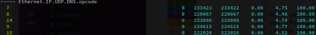
In the right (in-attack) file, there was the sudden emergence of unusual DNS request types. This shows there was a large number of opcodes 7, 8, 14, 9, and 15 with more than 200k packets seen per each compared to the “left” file in which none of these op codes were seen.
These opcodes are indeed highly unusual, as can be seen from the [IANA opcodes] that lists what these opcode values mean. Specifically, they are all in the unassigned range which indicates that either they were likely randomly chosen in the attack data or could even be an attempt to see if the server’s code base could properly handle different values.
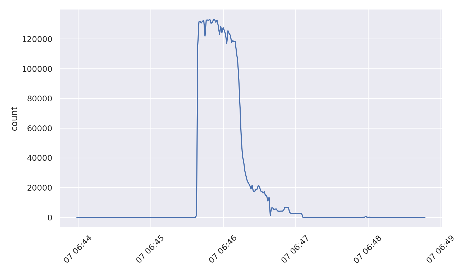
A significant increase in queries for example.com
This shows an interesting increase in queries for www.example.com, which may be from the attacker attempting to perform a real request for determining whether or not the server is still operating properly and returning valid responses.

This result is particularly interesting because it was not a known element of the attack based on the dataset’s description page. This shows the power of the traffic-taffy tool to find differences based on simple statistics that turned up a secondary attack source previously unseen in the otherwise overwhelming dataset of traffic.
We can quickly turn to graphing just this traffic component to examine its profile:
taffy-graph -C -m Ethernet_IP_UDP_DNS_qd_qname -M www.example.com -o example-com-traffic.png *.pcap.xz
Which produces the following graph:
An increase in the DNS truncated bit
Also seen in the comparison is that there is a significant jump in the use of the truncated bit. This comes from the server responding with the TC bit when a particular address hits the configured Response Rate Limiting threshold and requesting the client to re-ask over TCP.

This time we use trafic-graph’s -p flag to graph the percentages of traffic seen, rather than the raw value. We also do not specify a specific value to plot in order to see both values:
taffy-graph -C -m Ethernet_IP_UDP_DNS_tc -o dns-TC-bit.png -p *.pcap.xz
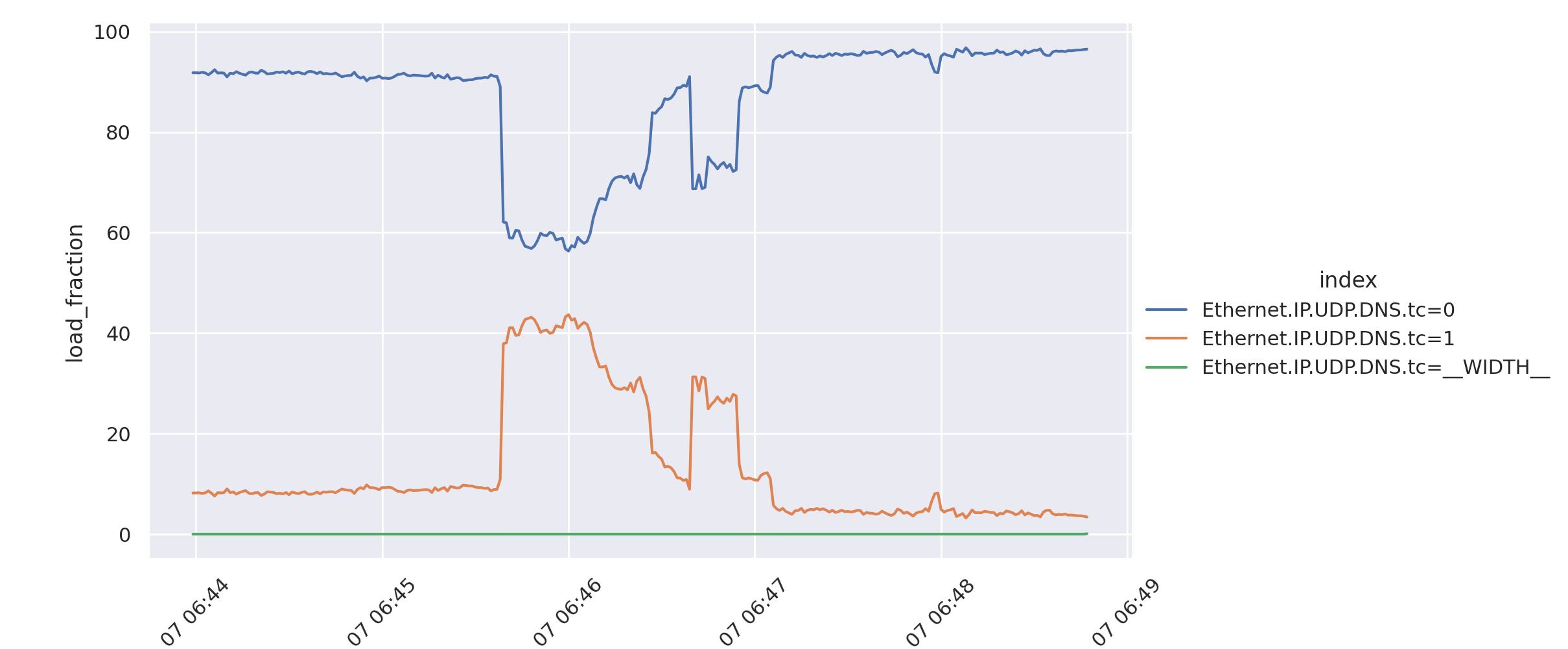
TODO: the graph has a bug – the zero field shouldn’t be 100%
And more
There are a large number of other interesting things worthy of study, but limit this documentation to just the above interesting cases. The dataset in question is available to researchers and may be requested if you wish to study the example further. Note that the dataset includes a lot more data from that day than is shown here.